

Kate Aliberti Styling
Logo Design
Kate Aliberti is a Richmond-based stylist with an exceptional eye and a rare gift for visual storytelling. As a prop, product, and soft-goods stylist, Kate creates truly captivating images. She knows that with a sharp eye and the right tools, whether that be an iron or a pair of tweezers, any shot can look beautifully effortless.
I created the logo for Kate with the need for a minimal but interesting logo with the focus on the K as the main element. We initially set out with using the verbiage “Food Styling” but decided to drop the food portion of that to make sure people knew Kate’s ability to capture stunning imagery goes far beyond culinary moments.
You can visit her website here: https://www.katealibertistyling.com/
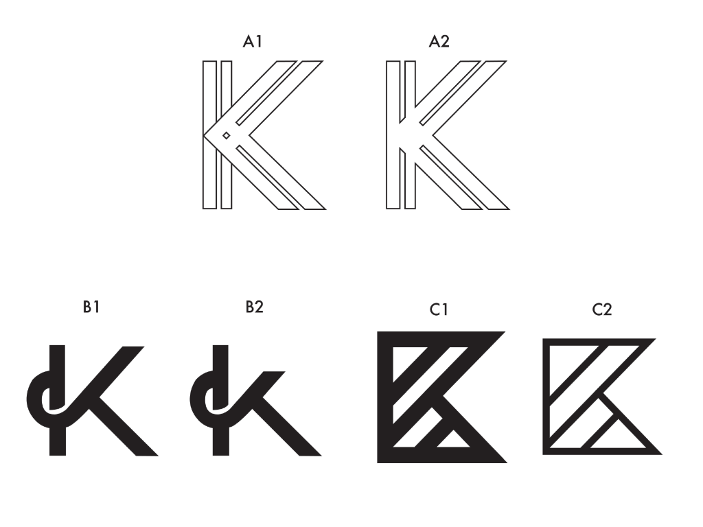
Lettermark Test Round 1
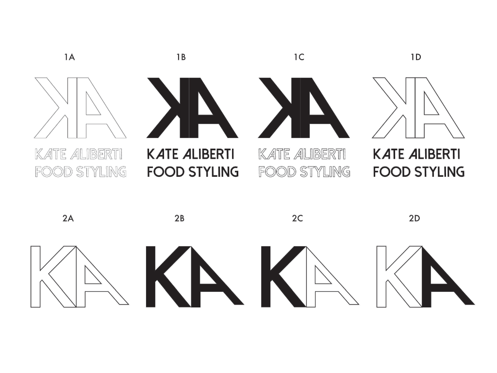
Lettermark Test Round 2
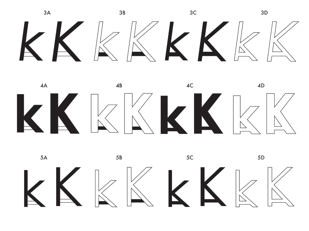
Lettermark Test Round 3
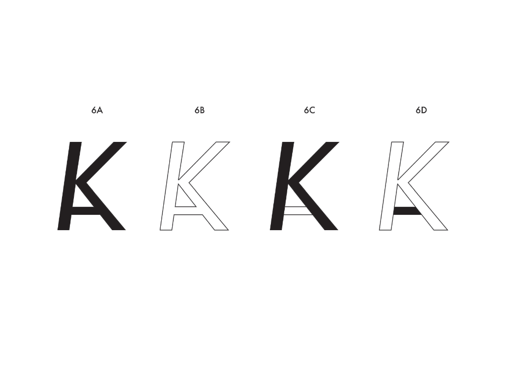
Lettermark Test Round 4
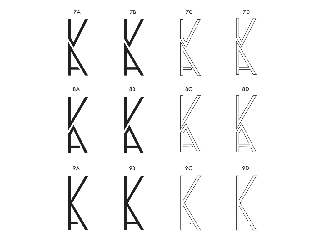
Lettermark Test Round 5
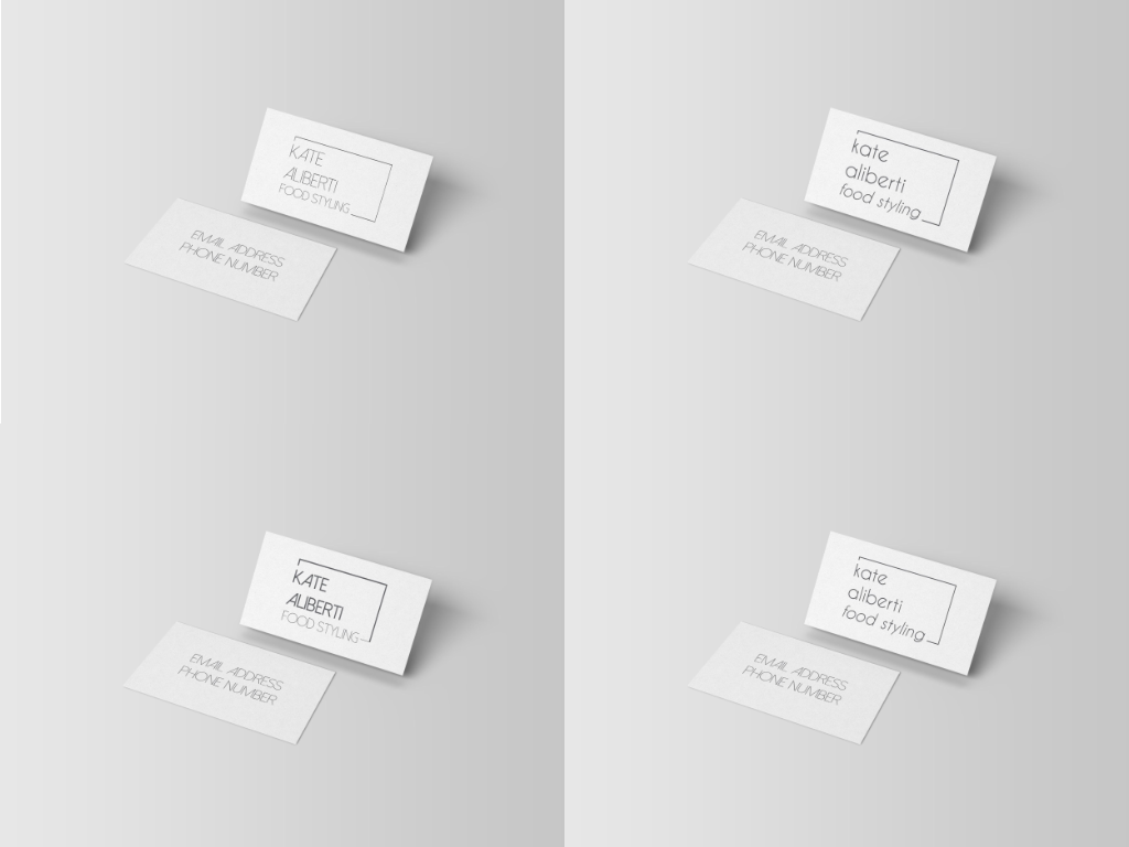
Full Logo Mockup 1
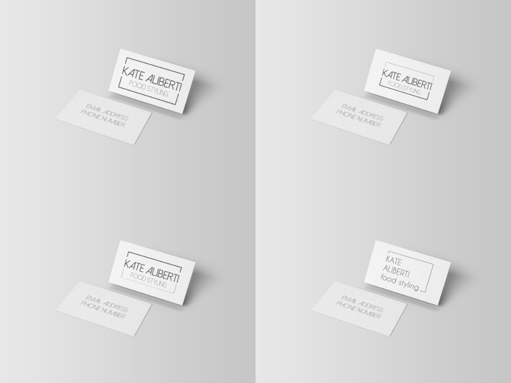
Full Logo Mockup 2